
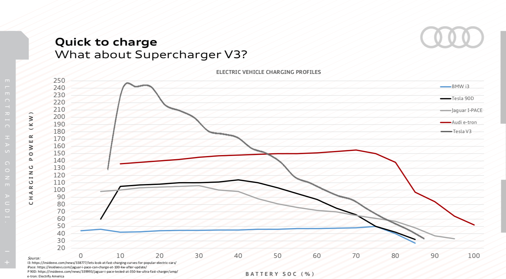
I recently drove the Audi E-Tron. During the press presentation, Audi presented an interesting chart. The story it tells is one of electric vehicle bragging rights. On one axis you have charging power. The other axis displays battery state of charge. Five vehicles are then compared, each one sharing a different charging profile. This display leaves me wondering if this is the next potential bit of braggadocio afforded to future enthusiasts?
The impetus for showing this chart is that it displays just how well and quickly the E-Tron takes a charge. Right away, an E-Tron that’s plugged into a 150kW-capable DC Fast Charger, will accelerate to its top charging speed. It will then hold that speed onward to around the 80% state of charge mark. Then it will slow down as it approaches 100% full.
By comparison, a Tesla at an all-new V3 Superchargers, quickly speeds to 250kW but only holds there for a brief bit of time before slowly working down as the battery fills up. Audi is very proud of that flat charging profile. Tesla loyalists are quick to point miles per minute of charging is a better metric, and they make some good points. But it’s still impressive to see how well Audi’s battery pack system can handle a powerful charging station.
Is this sort of chart going to replace a dyno sheet amongst automotive enthusiasts? We’ll still have torque and horsepower, but charging profiles could become the defacto “look at what my car can do” down the road.
Am I colorblind or do all the lines look like the same color except the BMW and the Jag?
No, they’re different colors. BMW is light blue, Tesla 90D is purple, Jag is silver, Audi dark red, and Tesla V3 is black.
Maybe my monitor sucks. Besides the blue one they all look like various shades of black/brown/grey.
Charging time is THE intrinsic drawback of EV’s, currently as compared to the alternative. This looks like an argument over who is the least bad.
It would be like an actual dyno chart among bottom rung econoboxes. Some will be better than others, but no one is buying them for how they stack up in this particular comparison.
Not to mention that unless things have changed, high charge rate still causes battery degradation.
Until battery range can get up to 800-1000 miles (a full day’s worth of driving), charge time with be the metric.
I suspect you are likely to remain disappointed for the foreseeable future at least. Would more than 1% of the population ever drive 800 miles in a day? I have, once.
On a practical side, that is more battery than you want to carry around the rest of the time. A Tesla 90 kWh battery is approx 1200 lb.
I wonder why the Audi line starts at the 10% mark? Also why Tesla fans can’t figure out that miles per minute and kW are not only expressing the same thing (charge rate), but the miles they are measuring depend on how much power the car uses to cover them.
Putting it in terms of ICE vehicles, a Corolla tank fills at double the miles per minute as a large pickup!
And how does the Tesla start at negative capacity? Personally, I get nervous when my tank gets to 10%. But then I’m a country boy where refueling needs planning….